分析客户")
用 K-Means聚类算法(K-Means Clustering)分析客户
市场团队一直在尽最大努力更多地了解他们的客户是谁。通过了解更多用户,团队将更好地了解如何根据客户行为创建营销活动、促销、特别优惠等等。
在本文中,我将演示如何使用 K-Means 聚类算法,根据商城数据集(数据链接)中的收入和支出得分对客户进行细分的。如果你想了解更多数据分析相关内容,可以阅读以下这些文章:
如何准备数据科学的现场编程面试?
微软数据科学家面试,都问什么SQL问题?
六条鲜为人知的SQL技巧,帮你每月省下100小时!
数据分析新工具MindsDB–用SQL预测用户流失
商场客户细分的聚类模型(Clustering Model)
目标:根据客户收入和支出分数,创建客户档案
指导方针:
- 1. 数据准备、清理和整理
- 2. 探索性数据分析
- 3. 开发聚类模型
数据描述 :
- 1. CustomerID : 每个客户的唯一ID
- 2. Genre:用户的性别
- 3. Age:用户当前的年龄
- 4. Annual Income (k$) : 用户的年收入 (千美元)
- 5. Spending Score(1-100):用户消费习惯(分数越高表示消费越多,反之亦然)
1 数据准备、清理和整理
#Import Library and Load File
import pandas as pd
import numpy as npdf = pd.read_csv('/kaggle/input/mall-customers/Mall_Customers.csv')
df.info() #checking data types and total null values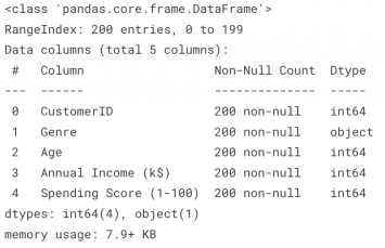
从输出结果中,我们可以看到数据框中有 5 列和 200 行,数据中没有空值。
让我们检查一下数据框中是否有任何重复的行。
#Checking If any duplicated values
print(f'Total Duplicated Rows : {df.duplicated().sum()}')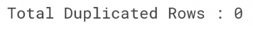
继续,我们来检查一下从 0 到 100 的每个数字列的百分位总结。
#Let's see the percentile from each numerical columns from the dataset

def percentile(df, column) :
    print(f'{column} Percentile Summary :')
    for a in range(0,101,10) :
        print(f'- {a}th Percentile : {round(np.percentile(df[column],a),2)}')

#Percentile for Age
percentile(df, 'Age')#Annual Income Percentile
percentile(df,'Annual Income (k$)')#Spending Score Percentile
percentile(df,'Spending Score (1-100)')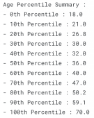
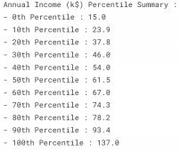
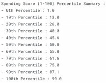
数字列百分位总结
#Count Each Gender total
gender_total = df['Genre'].value_counts().reset_index()
gender_total['perc_genre'] = round(gender_total['Genre']/sum(gender_total['Genre']),2)*100
gender_total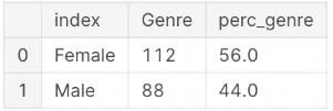
上文中,我们检查了 null、重复值、并显示了数字列的百分位数、和分类列中每个唯一值的总值。
接下来,我们将开始探索上面的一些数据,以更好地了解我们的数据集。
2 探索性数据分析
import matplotlib.pyplot as plt
import seaborn as sns
import plotly.express as px

num_cols = ['Age','Annual Income (k$)','Spending Score (1-100)']
def plot_stats(df, col_list) :
for a in num_cols :
fig,ax = plt.subplots(1,2, figsize = (9,6))

sns.distplot(df[a], ax = ax[0])
sns.boxplot(df[a], ax = ax[1])

ax[0].axvline(df[a].mean(), linestyle = '--', linewidth = 2, color = 'green')
ax[0].axvline(df[a].median(), linestyle = '--', linewidth = 2 , color = 'red')

ax[0].set_ylabel('Frequency')
ax[0].set_title('Distribution Plot')

ax[1].set_title('Box Plot')

plt.suptitle(a)
plt.show()

plot_stats(df, num_cols)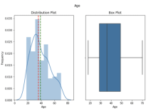
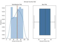

“Age”和“Annual Income(k$)”呈正偏态,我们想用第 10 和第 90 个百分位数替换异常值,来标准化(normalize)数据。
#Flooring and Capping by replacing outliers with 10th and 90th Percentile

#Age 10th Percentile and 90th Percentile
tenth_percentile_age = np.percentile(df['Age'], 10)
ninetieth_percentile_age = np.percentile(df['Age'], 90)

df['Age'] = np.where(df['Age'] < tenth_percentile_age, tenth_percentile_age, df['Age'])
df['Age'] = np.where(df['Age'] > ninetieth_percentile_age, ninetieth_percentile_age, df['Age'])

#Annual Income 10th Percentile and 90th Percentile
tenth_percentile_annualincome = np.percentile(df['Annual Income (k$)'], 10)
ninetieth_percentile_annualincome = np.percentile(df['Annual Income (k$)'], 90)
df['Annual Income (k$)'] = np.where(df['Annual Income (k$)'] < tenth_percentile_annualincome, tenth_percentile_annualincome, df['Annual Income (k$)'])
df['Annual Income (k$)'] = np.where(df['Annual Income (k$)'] > ninetieth_percentile_annualincome, ninetieth_percentile_annualincome, df['Annual Income (k$)'])plot_stats(df, num_cols) #Checking Distribution after replacing outliers with 10th and 90th Percentile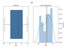

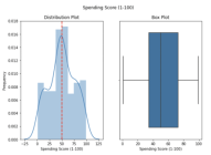
数据进行了标准化之后,从上图中我们可以看出,列上没有检测到异常值。
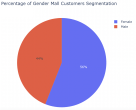
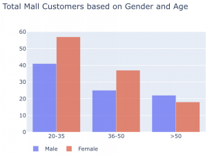
大多数顾客是女性(56%),根据年龄组,去购物中心的人大多是年轻人(20-35 岁年龄组)。
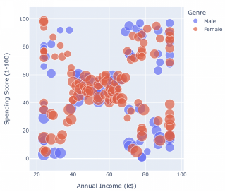
根据上面的散点图,我们可以看到大多数客户的平均收入和平均支出得分。除此之外,我们的数据集中还有 4 个基于收入和支出得分的独立组。
散点图可以总共分为以下几类:
- 1. 高收入 低支出
- 2. 高收入 高支出
- 3. 平均收入 平均支出
- 4. 低收入 低支出
- 5. 低收入 高支出
- 接下来,我们将用上面的 5 个类别来标记我们的数据。
3 开发聚类模型
from sklearn.preprocessing import MinMaxScaler
from sklearn.decomposition import PCA
from sklearn.cluster import KMeans#Normalize Numeric Features
scaled_features = MinMaxScaler().fit_transform(df.iloc[:,3:5])
#Get 2 Principal Components
pca = PCA(n_components = 2).fit(scaled_features)
features_2d = pca.transform(scaled_features)#5 Centroids Model
model = KMeans(n_clusters = 5, init= 'k-means++', n_init = 100, max_iter = 1000, random_state=16)
#Fit to the data and predict the cluster assignments to each data points
feature = df.iloc[:,3:5]
km_clusters = model.fit_predict(feature.values)
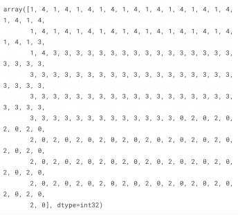
km_clusters为了用 KMeans 建立我们的聚类模型,我们需要对数据集中的数字特征进行缩放/归一化(scale/normalize)。
在上面的代码中,我用 MinMaxScaler() 把每个特征缩放到给定范围来转换特征。然后是 PCA,主要用于减少大型数据集的维数。
我在这个数据集中用到了PCA,只是为了举例说明如何在实际应用中使用这个方法。
作为结果,数据被归一化和缩减,然后我们就可以开始训练我们的聚类模型、标记数据集了。
这是生成的结果。
最后,我们用散点图可视化结果,查看我们生成的标签。
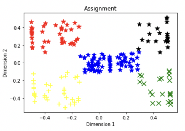
我们可以看到,每个组都根据数据集中的相似性进行了标记。
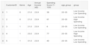
下面是客户分析的最终结果。
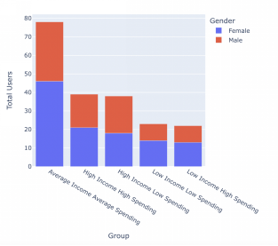
就是这样!这也是开发客户细分最流行的方法之一。我希望这篇文章能帮你创建自己的客户档案。感谢你阅读本文,如果你们想看更多数据分析相关文章,欢迎关注我们的公众号!你还可以订阅我们的YouTube频道,观看大量数据科学相关公开课:https://www.youtube.com/channel/UCa8NLpvi70mHVsW4J_x9OeQ;在LinkedIn上关注我们,扩展你的人际网络!https://www.linkedin.com/company/dataapplab/
原文作者:Kelvin Prawtama
翻译作者:Jiawei Tong
美工编辑:过儿
校对审稿:Jiawei Tong
原文链接:https://medium.com/mlearning-ai/customers-profiling-using-k-means-clustering-2264c3c30775


