
Python简化:使用ChatGPT进行数据可视化注释
向ChatGPT打个招呼吧,它是你在Python和Plotly世界中的新朋友!在本文中,我们将通过一些优秀的示例说明ChatGPT如何将在Plotly中创建和添加文本注释的繁琐任务变得轻而易举。如果你想了解更多关于Python的相关内容,可以阅读以下这些文章:
Python:释放效率——轻松简化你的日常工作!
Mojo:比Python快35000倍的AI编程语言
六个令人惊叹的小众Python库
为什么在R和Python之间选择?
读完本文后,你将准备好亲自尝试这些示例。
测试数据集—ChatGPT来救援!
在深入研究之前,我们先创建一个示例数据集并将其保存为CSV文件。我们将在所有示例中使用该数据集。
1.询问ChatGPT:“你能否提供一个电子商务商店每月销售数据的示例数据集,其中包含月份、销售和促销列,并将其保存为CSV文件?”
2.根据ChatGPT的响应,创建一个名为“monthly_sales_data.csv”的CSV文件,内容如下:
month,sales,promotion
Jan-2020,12000,0
Feb-2020,13000,0
Mar-2020,18000,1
Apr-2020,11000,0
May-2020,14000,0
Jun-2020,21000,1
Jul-2020,15000,0
Aug-2020,17000,0
Sep-2020,22000,1
Oct-2020,16000,0
Nov-2020,24000,1
Dec-2020,26000,1
现在,让我们深入研究示例!
示例1:促销时间到!
你有每月销售数据的条形图,并且希望通过促销突出显示那些特殊的月份。
不用担心!只需向ChatGPT寻求一些指导,它就会像专业人士一样为你提供完美的代码片段来添加这些annotation。现在我知道默认样式太小并且难以看到,因此我们会要求使用更大的,加粗的字体和一些带颜色的箭头。
1.询问ChatGPT:使用Python中的Plotly创建条形图,以可视化每月销售数据,并使用20pt粗体和3px粗红色箭头标记促销活动。
2.ChatGPT生成的代码:
import pandas as pd
import plotly.graph_objects as go

# Load your dataset
data = pd.read_csv("monthly_sales_data.csv")

# Create the annotations
annotations = []

for index, row in data.iterrows():
    if row['promotion'] == 1:
        annotations.append(dict(x=row['month'], y=row['sales'], text='<b>Promo</b>', font=dict(size=20, color='black', family='Arial, sans-serif'), showarrow=True, arrowhead=1, arrowcolor='red', arrowsize=1.5, ax=0, ay=-40, arrowwidth=3))

# Create the bar chart with annotations
fig = go.Figure(go.Bar(x=data['month'], y=data['sales']))
fig.update_layout(annotations=annotations)
fig.show()
ChatGPT创建一个字典,在显示之前存储每个annotation。通过样式annotation,我们可以清楚地突出显示每个有“促销”的月份。耶!
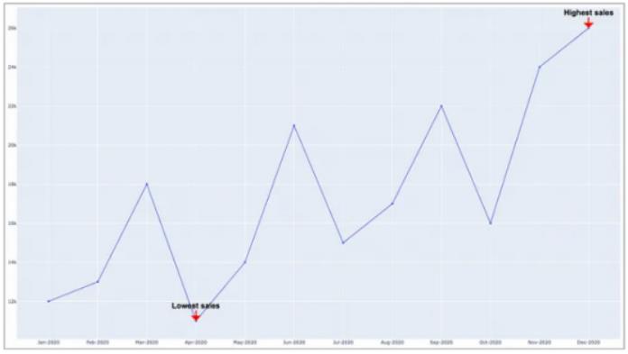
示例2:销售额的高点和低点
月度销售数据的折线图很好,但那些破纪录的高点和令人心碎的低点呢?询问ChatGPT如何annotation最高和最低销售额月份,很快就会得到答案。
1.询问ChatGPT:使用Python中的Plotly创建折线图,以可视化每月销售数据,使用20pt粗体和3px粗红色箭头标记最高和最低销售月份。
2.ChatGPT生成的代码:
import pandas as pd
import plotly.graph_objects as go

# Load your dataset
data = pd.read_csv("monthly_sales_data.csv")

# Get the highest and lowest sales months
max_month = data.loc[data['sales'].idxmax()]
min_month = data.loc[data['sales'].idxmin()]

# Create the annotations
annotations = [
    dict(x=max_month['month'], y=max_month['sales'], text='<b>Highest sales</b>', font=dict(size=20, color='black', family='Arial, sans-serif'), showarrow=True, arrowhead=1, arrowcolor='red', arrowsize=1.5, ax=0, ay=-40, arrowwidth=3),
    dict(x=min_month['month'], y=min_month['sales'], text='<b>Lowest sales</b>', font=dict(size=20, color='black', family='Arial, sans-serif'), showarrow=True, arrowhead=1, arrowcolor='red', arrowsize=1.5, ax=0, ay=-40, arrowwidth=3)
]

# Add the annotations to the line chart
fig = go.Figure(go.Scatter(x=data['month'], y=data['sales'], mode='lines+markers'))
fig.update_layout(annotations=annotations)
fig.show()
你可以查看每月最高销售额和每月最低销售额的annotation。我们确实需要增加字体大小——也许更大一点会更好。
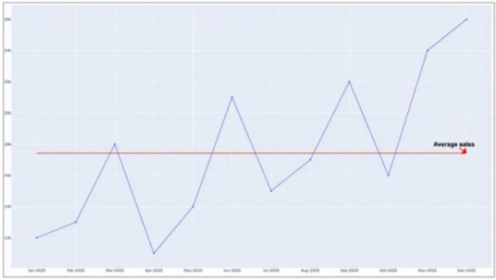
示例3:朋友,平均数是多少?
有没有想过折线图中所有月份的平均销售额是什么样子?ChatGPT为你提供支持!通过一个简单的问题,你将获得有关如何annotation电子商务商店平均销售额的指导
1.询问ChatGPT:使用Python中的Plotly创建折线图,以可视化每月销售数据,使用20pt粗体和5px粗红色箭头标记平均销售额。
2.ChatGPT生成的代码:
import pandas as pd
import plotly.graph_objects as go

# Load your dataset
data = pd.read_csv("monthly_sales_data.csv")

# Calculate the average sales
average_sales = data['sales'].mean()

# Create the annotations
annotations = [
    dict(x=data['month'].iloc[-1], y=average_sales, text='<b>Average sales</b>', font=dict(size=20, color='black', family='Arial, sans-serif'), showarrow=True, arrowhead=1, arrowcolor='red', arrowsize=1.5, ax=-40, arrowwidth=3)
]

# Add the annotations and a horizontal line for average sales
# Add the annotations and a horizontal line for average sales
fig = go.Figure(go.Scatter(x=data['month'], y=data['sales'], mode='lines+markers'))
fig.add_shape(type='line', x0=data['month'].iloc[0], x1=data['month'].iloc[-1], y0=average_sales, y1=average_sales, yref='y', xref='x', line=dict(color='red', width=2))
fig.update_layout(annotations=annotations)
fig.show()
此代码将找到平均值,然后在图表上显示该特定时间段内平均值的红线。
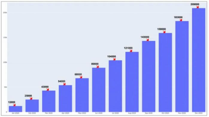
示例4:累计销售历程
看着条形图,想知道这几个月的销售额是如何增加的?ChatGPT可以帮助你在条形图上标注累计销售额!
1.询问ChatGPT:使用Python中的Plotly创建条形图,以可视化每月销售数据,使用20pt粗体和3px粗红色箭头标记累积销售额。
2.ChatGPT生成的代码:
import pandas as pd
import plotly.graph_objects as go

# Load your dataset
data = pd.read_csv("monthly_sales_data.csv")

# Calculate the cumulative sales
data['cumulative_sales'] = data['sales'].cumsum()

# Generate annotations for cumulative sales
annotations = []

for index, row in data.iterrows():
    annotations.append(dict(x=row['month'], y=row['cumulative_sales'], text=f"<b>{row['cumulative_sales']}</b>", font=dict(size=20, color='black', family='Arial, sans-serif'), showarrow=True, arrowhead=1, arrowcolor='red', arrowsize=1.5, ax=-30, arrowwidth=3))

# Add the annotations to the bar chart
fig = go.Figure(go.Bar(x=data['month'], y=data['cumulative_sales']))
fig.update_layout(annotations=annotations)
fig.show()结果显示图表中每个条形(月份)的annotation。我们可能想要稍微不同的样式,但功能是存在的。
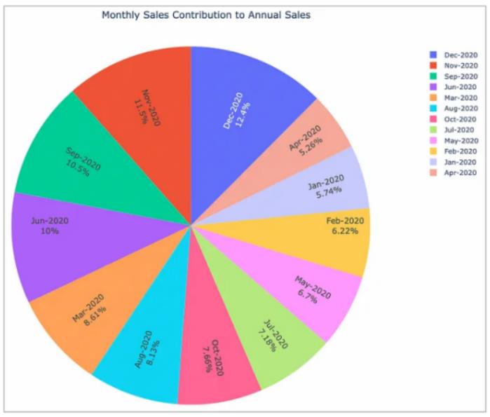
示例5:饼图派对
谁不喜欢漂亮的饼状图呢?如果你可以标注每个月的销售额占年度总销售额的百分比会怎么样?ChatGPT可以做到!
1.询问ChatGPT:使用Python中的Plotly创建饼状图,以可视化按类别的销售数据,以及每个类别的销售额百分比和绝对值。
2.ChatGPT生成的代码:
import pandas as pd
import plotly.graph_objects as go

# Load your dataset
data = pd.read_csv("monthly_sales_data.csv")

# Calculate the total sales for the year
total_sales = data['sales'].sum()

# Calculate the percentage contribution of each month's sales
data['percentage'] = (data['sales'] / total_sales) * 100

# Create the pie chart with annotations
fig = go.Figure(go.Pie(labels=data['month'], values=data['percentage'], textinfo='label+percent', insidetextorientation='radial'))

# Customize the pie chart
fig.update_traces(hoverinfo='label+percent', textfont_size=14)
fig.update_layout(title_text='Monthly Sales Contribution to Annual Sales', title_x=0.5)

fig.show()
代码生成了一个漂亮的饼状图。我知道,数据可视化纯粹主义者会说“为什么要使用饼状图来显示此数据?”。我同意他们的观点,但我只是演示如何使用annotation来提供更清晰的视觉显示。
总结一下……
所以,你知道了!ChatGPT使得在Plotly中创建和添加annotation变得轻而易举。不要错过通过使用ChatGPT进行Python编码来提升数据可视化游戏的机会。如果你不适应这个游戏规则改变者,你很快就会被甩在后面。快乐编码,享受通过ChatGPT在你身边获得的额外时间!你还可以订阅我们的YouTube频道,观看大量大数据行业相关公开课:https://www.youtube.com/channel/UCa8NLpvi70mHVsW4J_x9OeQ;在LinkedIn上关注我们,扩展你的人际网络!https://www.linkedin.com/company/dataapplab/
原文作者:BYJohnLoewen,PhD
翻译作者:黄豆
美工编辑:过儿
校对审稿:Chuang
原文链接:https://python.plainenglish.io/python-simplified-data-visualization-annotations-with-chatgpt-4f9bb74f3054


