
学会了 Tableau 和 R 的这个用法以后,4875个有志之士拿到了FLAG的offer
大家有没有仔细阅读我们之前给大家准备的高级人数据可视化指南?是不是很期待今天的数据可视化与数据处理器联姻指南!来吧!
Introducing R programming in Tableau
我喜欢 Tableau 不仅仅是一个拖放动作就能创建漂亮图表的工具。随着 2013 年 Tableau 8.1 的发布,涌现了大量新功能。随着 R 的引入, Tableau 可以实现动态并且更丰富的可视化图表。并且 R 可以与 Tableau 一起用于关于聚类,预测等技术。
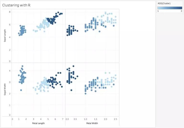
我想通过 clustering 来研究 R 和 Tableau,所以我使用了非常出名的数据组的 Iris Dataset。(数据集回复后台 Iris 获得)它包含不同的 features来 区分种类型的花:Virginica,Setosa 和 Versicolor。正如您在下图中所看到的,用R语言非常容易创建这3种类型花的簇类:
有兴趣自己制作吗?首先让我们深入了解基础知识和安装过程,然后再深入研究可视化!
1. 安装R (https://cran.r-project.org/)
2. Install the Rserve package
安装 Rserve 包
3. Run the following in the R command line:
跑以下R程序:
install.packages(“Rserve”); library(“Rserve”); Rserve()
4. Configure Tableau to run in R
将 Tableau 配置为在R中运行
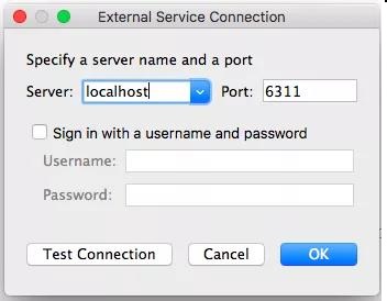
5. Open Tableau –> Help –> Settings and Performance –> Manage R / External connection. Fill in the fields with the following default information and select Test Connection:
打开 Tableau –> Help –> Settings and Performance –> Manage R / External connection
使用默认信息填写字段,然后选择“Test Connection”:
As was shown in the image above, you make use of Tableau’s Table Calculation to communicate with R :
确保Tableau’s Table Calculation已经与R连接上了。
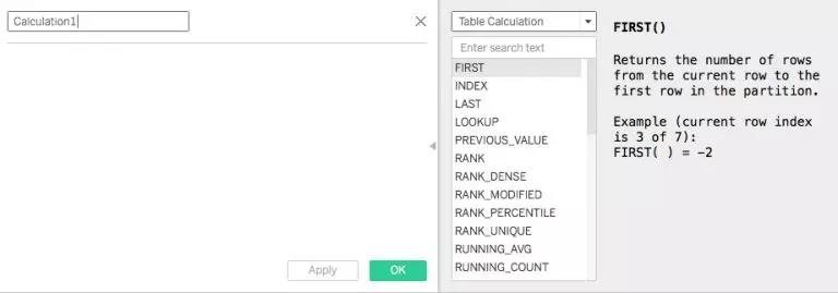
If you scroll down the list of functions, you will come across the following four:
如果你往下滑, 可以找到以下四个方程:
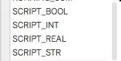
当这些函数包含在 Calculation Area 中时,Tableau 会自动理解脚本是用于 R 的。
(数据集回复后台 Iris 获得下载链接)
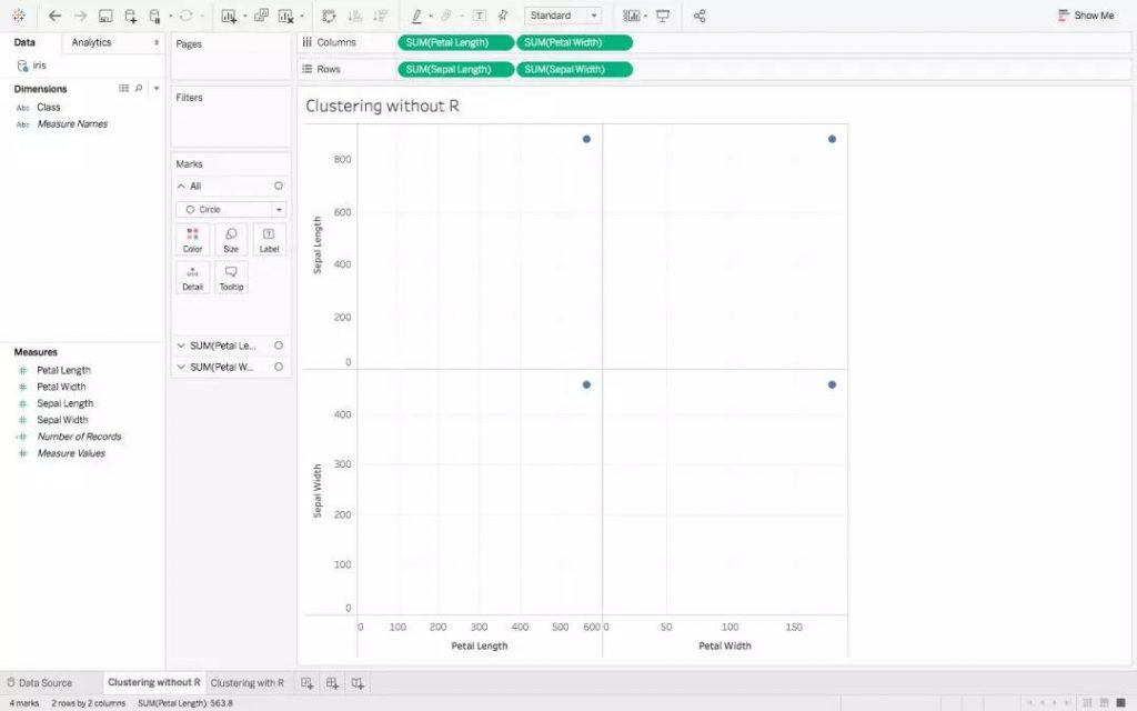
1. Import the dataset in Tableau, and make the below graph 加载数据后, 画以下的图表:
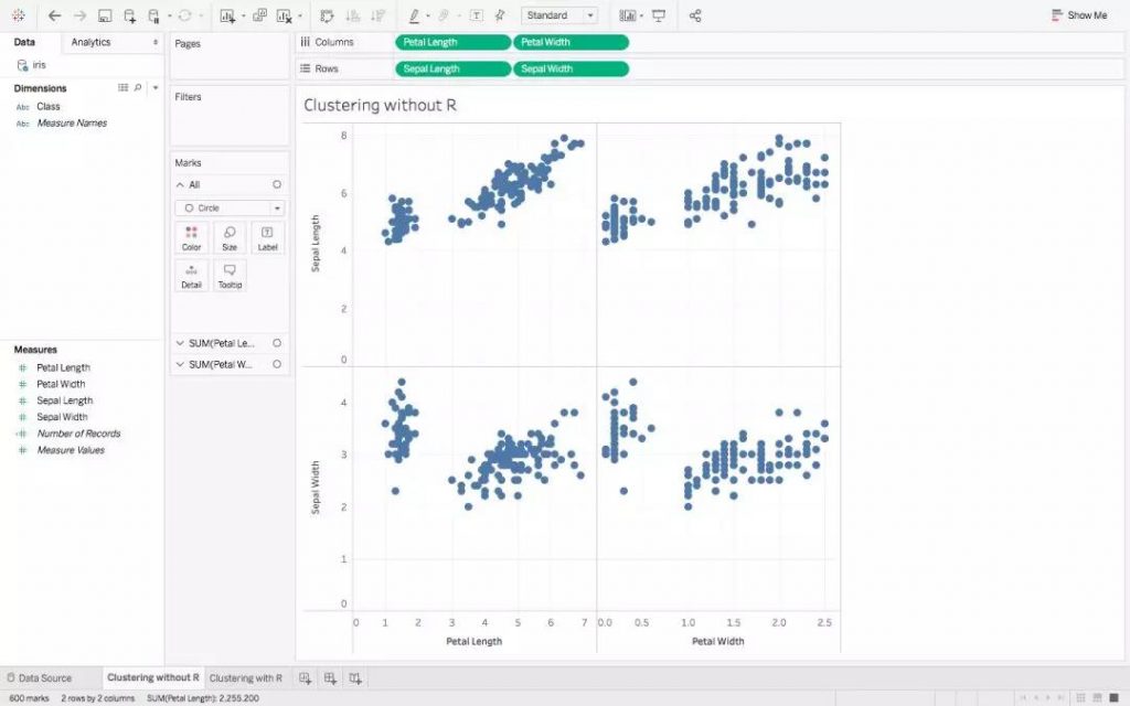
2. Here you are getting the Sum across different Measures. To get discrete values, go to Analysis, and uncheck Aggregate Measures, to get:
在上图中显示的是获得不同Measure的总和。我们要获取Discrete Values, 所以我们转到Analysis,并取消选中Aggregate Measures:
3. Finally, to form the clusters, drag the Class Dimension over Color in the Marks Pane:
最后形成聚类,在“Mark Pane”中将“Class”拖到“Color”上:
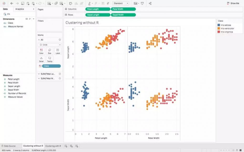
我们上面的内容是散点图,它显示了分为3个不同簇的数据点集群。
Let’s try doing the same with R now, and compare the two visualizations that we will get. We will be using the most common clustering algorithm, K-Means:
我们现在尝试用R做同样的事情并比较两个可视化的图形。我们将使用最常见的聚类算法K-Means:
1. Begin with the same scatter plot as point 2 above.
从上面相同的散点图Point 2开始。
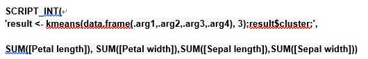
2. Create a new Calculated Field and fill it with the following:
创造一个新的 Calculated Field 并且加入以下信息:
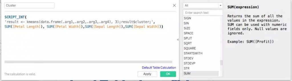
For clarity, the above Calculation is :
具体的计算为下图:
最后在 Marks Pane 中将新形成的 Field Cluster 拖动到Color,聚类图就完成了!
虽然有一些重叠,但这两个可视化看起来确实很准确。这是R与Tableau应用一个小小的要点。它们的应用程序含有无限的可能的, 我相信你已经开始考虑与它们更多的交互的不同方式了吧。
原文作者:PAVLEEN KAUR
翻译作者:Zihao W.
美工编辑:Miya
校对审稿:卡里


