
高级人数据可视化升级打怪指南
A Step-by-Step Guide to learn Advanced Tableau – for Data Science and Business Intelligence Professionals 学习高级Tableau的分步指南 – 适用于所有数据科学和商业分析的高级人。
“See the data. Show the visual. Tell the story. Engage the audience.”
Tableau 是当今数据科学和商业智能专业人员使用的最流行的数据可视化工具之一。它能够以交互的丰富多彩的方式创建极具洞察力和影响力的数据可视化图形。
它的用途不仅仅是创建传统的图形和图表。它其实还有非常多的 feature 和可以自定义的东西,你可以使用它来挖掘你想象不到的极具 insight 的瑰宝。
Tableau 确实是出了名的简单好用,很多时候你只需要一些简单的点击拖拽就可以制作出很好看的可视化图表。你瞅瞅看这个!
但今天,我们要说点不一样的!我们要介绍一些“不仅仅是拖拽”高级技能点。同时,我们也要对产生这些可视化的数据有一些新的认知。最后,我们还会强势介入R与Tableau的联姻,看看会有什么神奇的事情发生。
读这篇文章的你,大概或许都还蛮厉害的,至少对于 Tableau 都是比较了解的吧?
如果你还不够了解,你可以回复后台“我要学习Tableau”,我把补充资料给到你!
来看看我们今天都会说些什么吧!
高级图表之 Motion Chart 动态图
高级图表之 Bump Chart 凹凸图
高级图表之 Donut Chart 甜甜圈图
高级图表之 Waterfall Chart 瀑布图
高级图表之 Pareto Chart 帕累托图
几乎所有Tableau用户都了解各种基本图表。这些是可以使用Tableau的“Show Me”功能轻松制作的。但由于这是一篇文章针对更高级的你,我们将使用超越“Show Me”的高级功能来满足你的需求,同时我们也会探索一些需要额外的高级计算才能得到的图表。
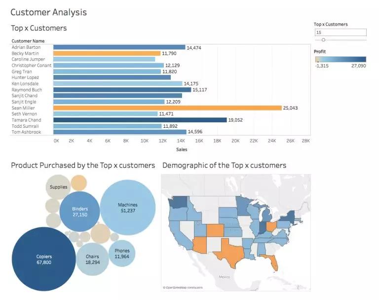
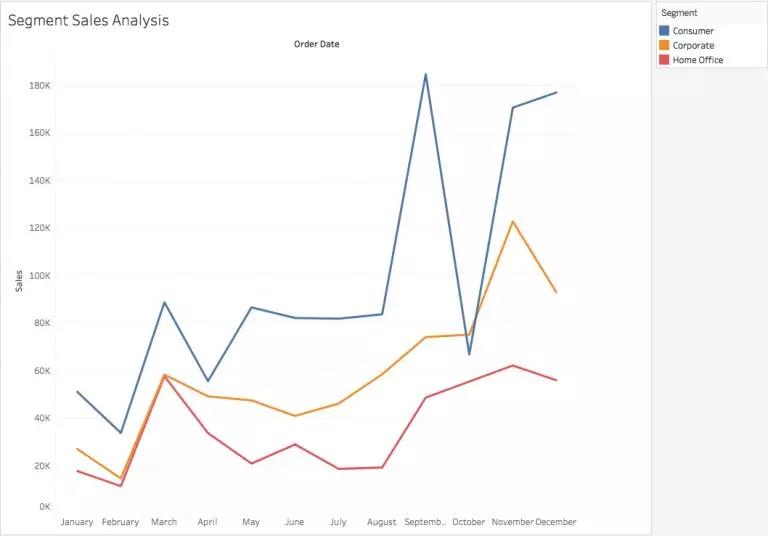
首先,让我们看看接下来我们要做些什么。下图是我们超市的销售和利润的一些基本分析。(数据集回复后台 Superstore 获得)下图的数据可视化简单地分析了这个超市的营业额和利润。简单的图标或许也可以展示同样的目的,但是我觉得不一般般的你是更愿意展现这种不一般般的高级图表的。毕竟很多时候这些高级的灵魂才是真的能让你的金主爸爸们亦可赛艇的东西。
高级图表之 Motion Chart 动态图表
先让我们来看一个可视化作品,来自 Hans Rosling 的 World Economics Representation 链接在这里:
https://www.gapminder.org/tools/#$chart-type=bubbles
是不是很高级?!你是不是也很想做一个一样的可视化效果!如果你在担心你不会做动画,也买不起 Adobe全套,那你怕是想太多了!Motion Chart 本chart给你飞一般的感觉。这个动态图表可以让你实时查看数据的变化,是不是老高级了?
让我们首先下载Superstore数据集。(数据集回复后台 Superstore 获得)
并且制作下图应该对熟悉Tableau的您来说应该很容易:
但是我们在这章节里要学的是动态的可视化图形:
步骤:
1. Import your dataset, and create the aforementioned Trend Chart. Our X-axis was the Order Date (in the format of Month) and Sales and Profit are the Measures. 导入数据集,并创建上述趋势图。我们的X轴为订单日期(格式为月),销售和利润为Y轴。
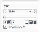
2. All you need to do to make the Motion Chart is drag Order Date over to the Pages shelf, and change the format again to match with the X-axis. 所有你要做的事情就是将Order Date拖到 Page shelf 然后更改Order Date的格式与X轴的格式匹配。
3. Change the Mark Type from Automatic to Circle. 将Mark Type从Automatic更改为Circle。
4. Go to Show History, and select Trails to view the trend change. And voilà! Your Motion Chart is ready for launch. 转到“Go history”,然后选择“Trails”以查看趋势的变化。完成后, 你的动态图表就蓄势待发了。
5. Press on the arrow buttons to see the motions, change the Show History customizations, the speed etc.,: 箭头按钮用于查看动作轨迹,更改显示历史记录,自定义,速度等等功能。
高级图表之 Bump Chart 凹凸图表
假设你想要探索Superstore各个细分市场的销售情(整整一年)。
一种方法是:
另一种方法也能达到相同的目的:
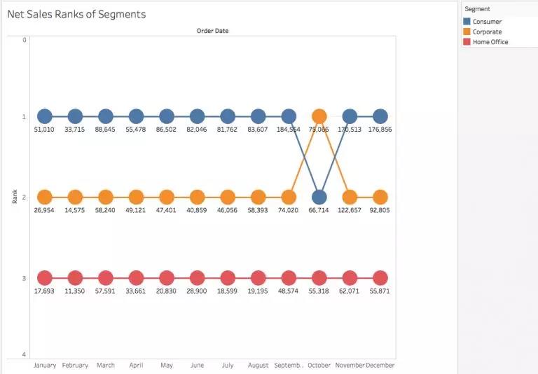
虽然折线图目的在于显示每个细分之间的销售差异,但凹凸图表(第二张图)给出了相同但更清晰简洁的图像来说明了销售差异。
这些图表主要用于体现特定的产品根据年份的不同受欢迎程度地变化。
让我们自己尝试一下:
1. First we need to think of the Measure on the basis of which we wish to rank our Dimensions. Here the Measure we have taken is Sales and the Dimension is Segment.
首先,我们需要考虑Measurement和Dimensions。在这里,我们的Measure是Sales,Dimension是Segment。
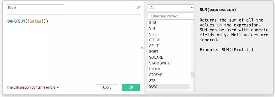
2. You need the help of a Calculated Field to make Bump Charts. So quickly create a calculation as below below. We are going to rank the Sum of Sales for each Segment :
你需要Calculated Field的帮助才能生成Bump Charts。所以我们用快速创建来创建如下的计算, 并且我们将对每个细分市场的销售总额进行排名:
3. Now drag Order Date over to the Columns and change the format to Month. Drag Segment to Colour in the Marks Pane. And finally drag Rank over to the Rows.
现在将Order Date拖到Columns并将格式更改为月份。在“Marks Pane”窗格中将Segment拖动到“Colour”。最后将Rank拖到Rows里。
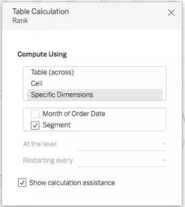
4. In the graph that you can see now, the Ranks have been allocated based on the number of months. However, we need them to be on the basis of Segments. So right click on Rank in Rows, and go to Edit Table Calculation.
你现在可以从图表中看到数据根据月份分配了排名。但我们需要数据基于Segments。接下来右键单击Rows中的Rank,然后转到Edit Table Calculation。
5. Since we wish to Compute Using Segment, change the configuration to:
由于我们希望使用Segment,请将配置更改为:
因为它没有标签所以你获得的图形看起来不并像数据板中的图形。但我们可以使用Dual Axis让我们快速解决这个问题:
6. Drag Rank again onto Rows and repeat Steps 4 and 5 to get:
将Rank拖到Rows上并重复步骤4和步骤5便获得:
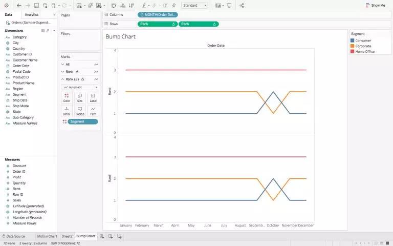
Yousee Rank and Rank (2) in the Marks Pane? We are going to use these to create those circled Labels.
能看出Marks Pane中的Rank和Rank(2)的区别吗?我们将使用marks pane的图形来创建带圆圈的labels.
7. To convert the above into a Dual Axis Chart, right click on the second chart’s Rank axis and choose Dual Axis.
首先我们将图形转换为Dual Axis Chart,右键单击第二个图表的Rank轴并选择Dual Axis。
8. In the Marks Pane, choose either Rank or Rank (2), and change the Mark Type to Circle instead of Automatic.
在Marks Pane中,选择Rank或Rank(2),然后将Mark Type从Automatic更改为Circle。
9. Here the Ranks are in descending order. To change it to ascending, right click on the left Rank axis – > Edit Axis – > Reversed Scale. Repeat the same for the right Rank axis as well.
现在的rank为降序排列,我们要将其改为升序排序。单击右键左侧的Rank轴 – >“Edit Axis” – >“Reversed Scale”。然后对右侧的Rank轴也重复相同的操作。
10. Finally, drag Sales onto Labels – > Quick Table Calculation – > Percentage of Total, to get our desired bump chart.
最后,将Sales拖到Labels – >Quick Table Calculation – >Percentage of Total,然后便获得了我们想要的凹凸图表。
高级图表之 Donut Chart 甜甜圈图(圆环图)
甜甜圈图是基本图表的另一种表达方式。总的来说就是饼图中间有一个洞,但它相比于饼图更多地强调各个部分的表示,如下所示:
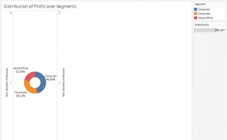
1. We will begin with a simple Pie Chart depicting the Profits of each Segment:
我们将从一个简单的饼图开始并且描绘每个Segment的Profits:
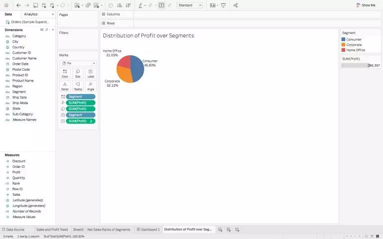
2. To create a Dual Axis for the Pie Chart, drag Number of Records from Measures over to the Rows, twice. Change the Measure of each green pill, by right clicking on them and choosing Minimum in place of the default Sum:
为饼图创建 Dual Axis 将 “ Number of Records ” 从“ Measures ”拖动到“ Rows ”两次。更改每个green pill的Measures,右键单击它们并选择最小值代替默认总和:
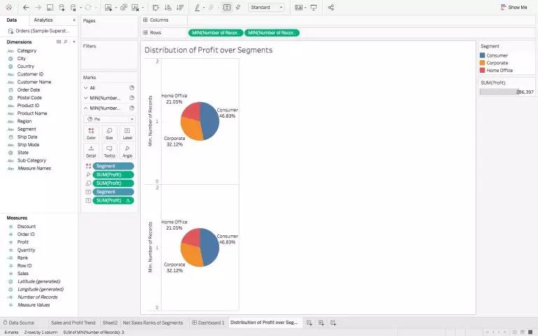
3. Choose the second Pie Chart in the Marks Pane, and drag every Measure / Dimension out of it. Reduce the size of the chart, and change the color to white (although not shown here):
在Marks Pane中选择第二个Pie Chart并将所有“Measure/Dimension”拖出。然后减小图形的大小然后将颜色更改为白色:
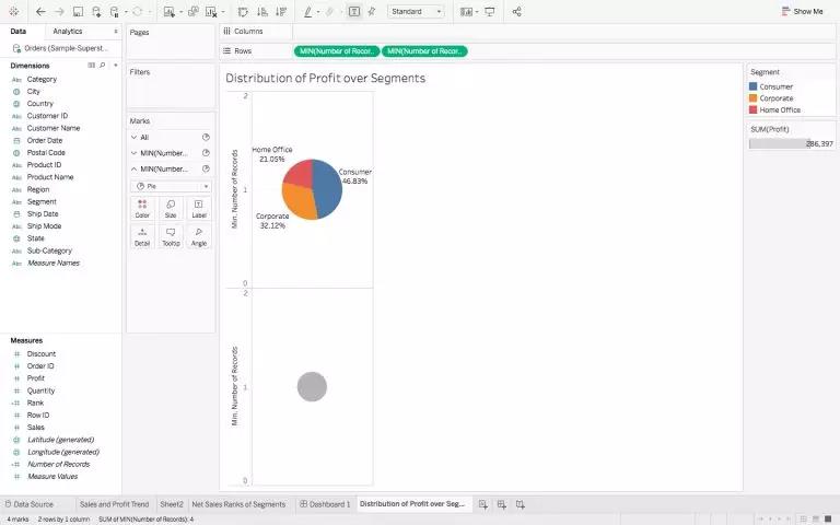
4. To create theDual axis, right click on the second Pie Charts’Y – Axis, and select the Dual Axis, to get your chart.
为了制作Dual Axis,右键单击第二个饼图的Y轴,然后选择Dual Axis获取图形。
说到这里,你现在应该大概已经了解了,所有上述图表虽然在最终外观上看上去很高级的,但所有图形都来自普通 “Show Me” 的核心功能。
高级图表之 Waterfall Chart 瀑布图
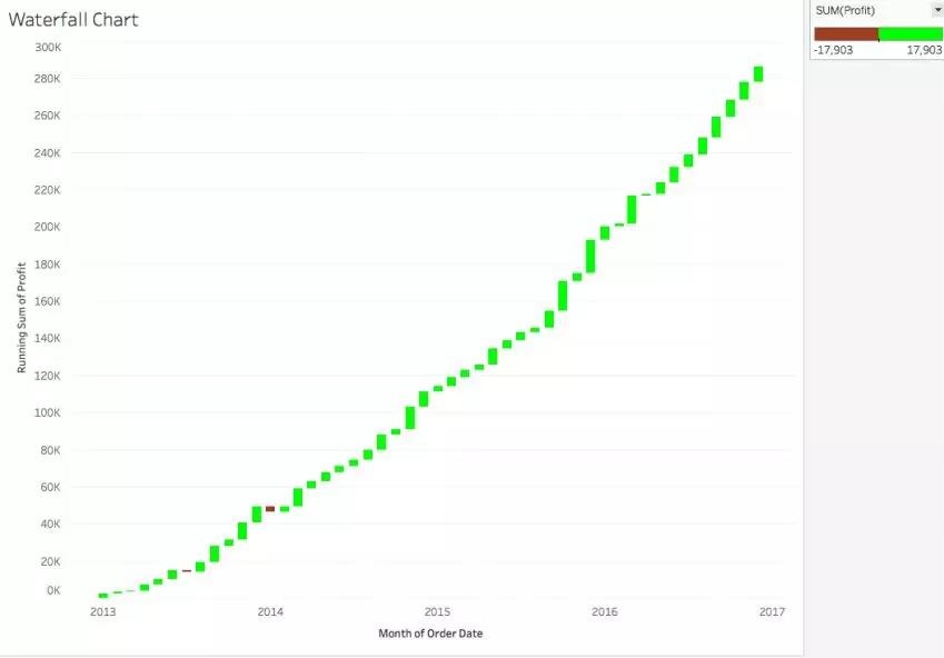
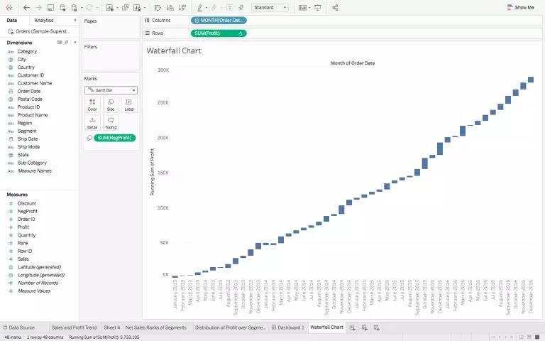
瀑布图的名称来自其类似水流的方向和流动。上图我们绘制了多年来超市Running Sales的情况,我们可以看到2013年中期和2014年初的两个小红色区域表明销售额实际下降而且也能看到下降了多少。
这意味着这些图表用于分析Measure的cumulative effect,并展示数据如何作为一个整体来呈现增加或减少。为了更好地理解这一点,请你跟着我一起疯狂脑补。
瀑布图是折线图的衍生物,因此我们将从此图开始:
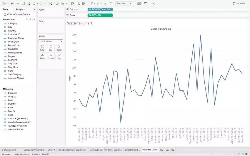
1. Right-click on the green Profit Pill, and select Quick Table Calculation –> Running Total.
右键单击绿色的 Profit Pill 然后选择 Quick Table Calculation –> Running Total。
2. Change the Mark Type from Automatic to Gantt Bar:
将 Mark Type从Automatic 更改为 Gantt Bar:
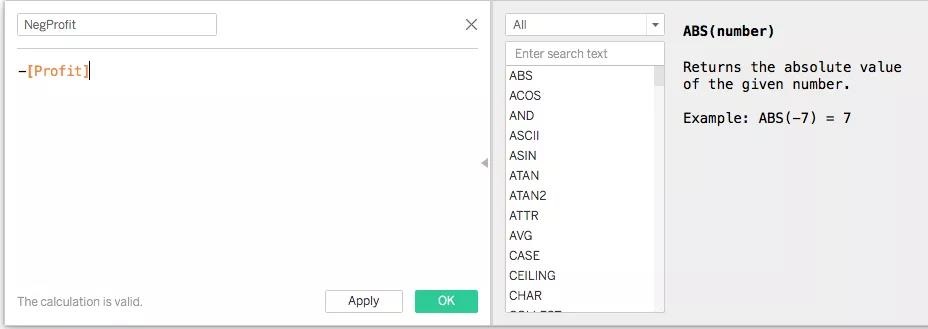
3. Create a Calculated Field called ‘NegProfit’:
创建一个Calculated Field “NegProfit’:
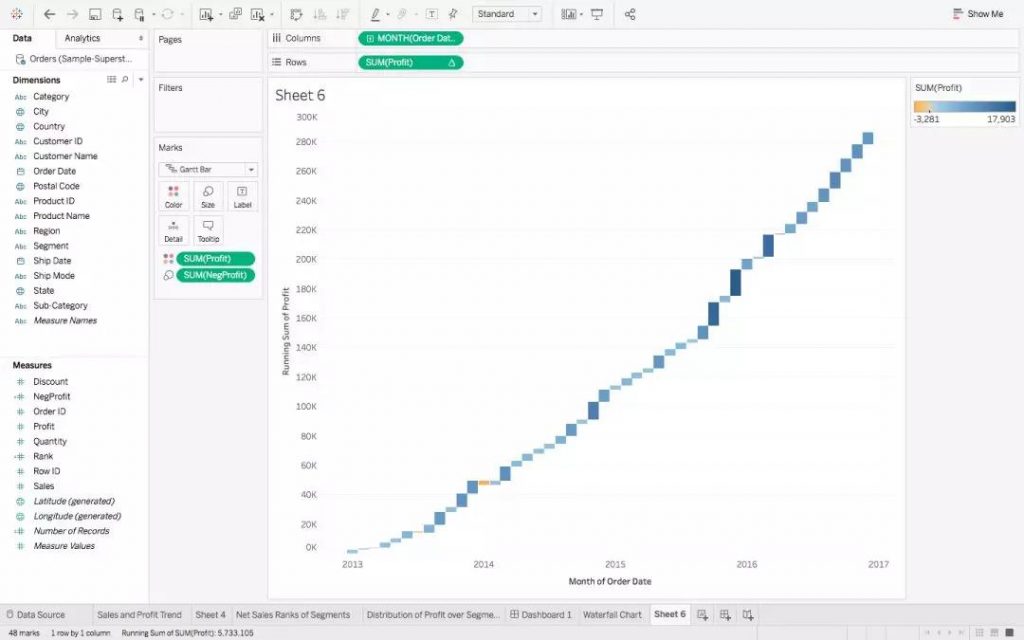
4. Drag this NegProfit over Size in the Marks’ shelf to get:
然后将NegProfit拖动到Marks Shelf中的Size,得到:
The calculated field was used to fill in the space in the Gantt Chart. A negative value in Profit would extend the bar downwards, whereas a positive one would extend it upwards.
Calculated Field用于填充Gantt Chart中的空白空间。利润中的负值会使bar向下延伸,反之正值会向上延伸。
The length of each small bar in the chart represents the amount of change in Profit from one month to the next.
图表中每个小条的长度表示从一个月到下一个月的利润变化量。
5. Finally, drag Profit over to Colour :
最后,我们把 Profit 拖到 Colour 里:
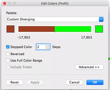
6. You can go ahead and change the colour to a two-step variation and distinctly view the rise and fall :
我们可以继续改变上升与下降的颜色让我们更清楚地观察上升和下降:
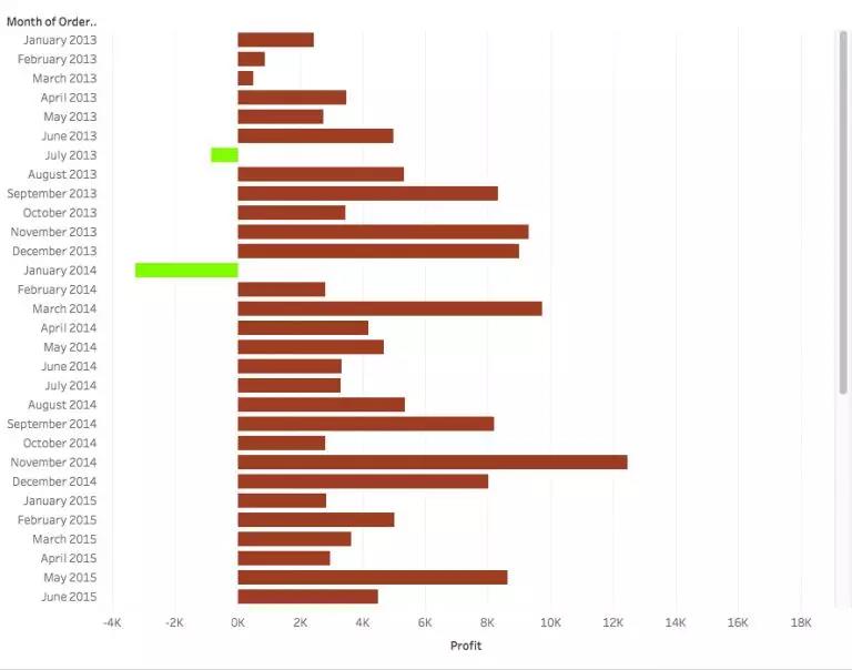
The graph that you will get could be very easily represented in the form of a Bar Chart as well. Do note that I have reversed the colors here, to make the anomalies stand out:
以条形图的形式表示以上的结果也非常的清晰。我在这里颠倒了颜色以使我们的异常值更突出:
But I am sure you would agree that using a Waterfall chart was a more intuitive way of representing the data, especially to see the changes in Measures such as Sales and Profit over the years.
使用瀑布图表是一种更直观的方式来展现数据,尤其是看多年来销售和利润等变化。
高级图表之 Pareto Chart 帕累托图
下面这个可视化图表运用了现在非常popular的 “80-20 principle”的数据分析原理, 放在我们superstore的这个case里来说就是,这个超市百分之八十的营销额是来自于超市百分之二十的产品。
现实中,人们不会指望面包和鸡蛋具有与蛋糕相同的销售总价,这正被称为80-20 principle。这意味着80%的销售额来自其的20%的产品。在超市的case中,这个原则可以在下面的可视化图标中看到,其中大部分销售是由手机和椅子产生的:
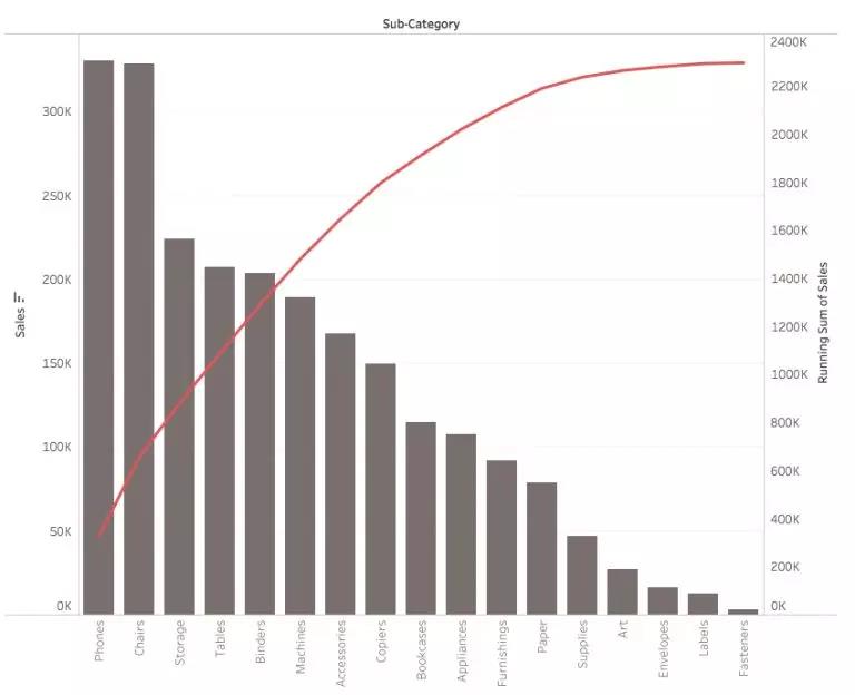
帕累托图通常用于风险管理 Risk Management,这个图表其实是一个非常实用且流行的,这类图一般会被拿来用于确定对项目产生最负面影响的最常见的问题。
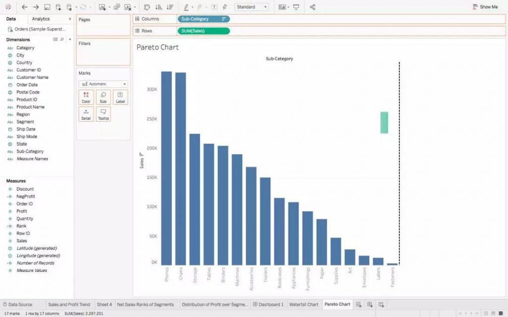
1. We are going to start off with the following chart. This has Sub Category as the X-axis and Sales as the Y-axis. The graph is in descending order:
我们将从下面的图表开始:Sub Category作为X轴,Sales作为Y轴,按降序排列:

2. Next, drag Sales over to the chart, until you see a green highlighted bar, and a dotted axis towards the far right :
接下来, 将Sales拖到图表上直到看到绿色突出显示的条形图和最右边的虚线轴:
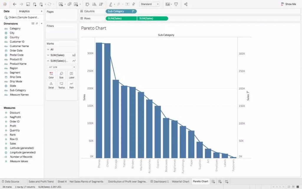
3. Drop Sales here to create a Dual Axis. Change the Mark Type of the first chart to Bar, and of the second chart to Line, to finally get :
然后撤掉Sales变量然后创建Dual Axis. 将第一个图表的Mark Type更改为Bar, 将第二个图表的Mark Type更改为Line,最后我们得到:
4. Right click on the second green Sales Pill, and add a Running Total Calculation to it:
最后右键单击第二个绿色Sales Pill,并为添加一个Running Total Calculation:
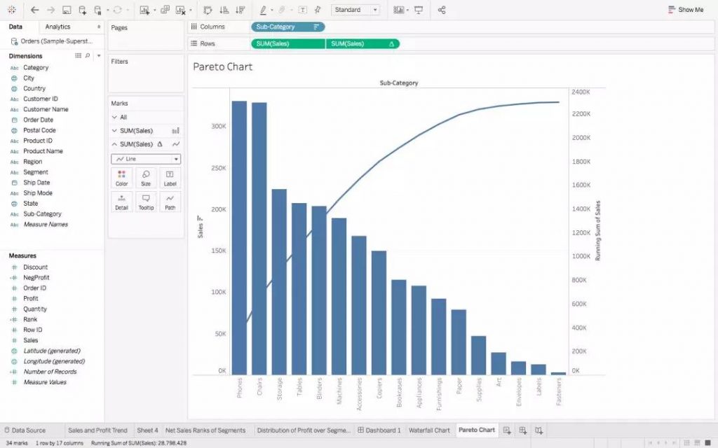
5. All that is left is to just change thecolourschemes, and your Pareto Chart is ready!
剩下的就是改变颜色方案,然后你的帕累托图就准备就绪了!
介绍完今天的高级图表,不知道作为高级人的你是不是觉得超级有用?
在今天文章的姊妹篇里我们会继续为大家介绍如何促成 Tableau 与 R 的联姻!不见不散呀。
原文作者:PAVLEEN KAUR
翻译作者:Zihao W.
美工编辑:Miya
校对审稿:卡里


